Register
Log In
Larian Studios
Forums
General
About this website
New RR header
Forums
Calendar
Active Threads
Previous Thread
Next Thread
Print Thread
Re: New RR header
#
129613
25/11/03
04:41 PM
Joined:
Nov 2003
Plowking
old hand
Plowking
old hand
Joined:
Nov 2003
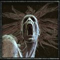
It's cool, and a big improvement over the other one.
The characters just didn't look right, their shape was 'off' somehow.
There's a much nicer and natural look (for want of a better expression) to this new banner.
Copy Link to Clipboard
Entire Thread
Subject
Posted By
Posted
New RR header
Lynn
21/11/03
04:32 PM
Re: New RR header
Lynx
21/11/03
05:32 PM
Re: New RR header
Sean
21/11/03
06:24 PM
Re: New RR header
Wendy
21/11/03
11:46 PM
Re: New RR header
AlrikFassbauer
22/11/03
12:25 AM
Re: New RR header
spick
22/11/03
08:11 AM
Re: New RR header
Morbo
22/11/03
11:02 AM
Re: New RR header
Jurak
22/11/03
03:33 PM
Re: New RR header
GoldyLocks
23/11/03
02:43 AM
Re: New RR header
Jurak
23/11/03
06:51 AM
Re: New RR header
Viper
23/11/03
10:49 AM
Re: New RR header
GoldyLocks
23/11/03
11:21 PM
Re: New RR header
Hellfighter
23/11/03
11:29 PM
Re: New RR header
Propheet
24/11/03
02:48 AM
Re: New RR header
janggut
24/11/03
04:51 AM
Re: New RR header
Kejero
24/11/03
08:59 AM
Re: New RR header
Marian
24/11/03
09:14 AM
Re: New RR header
LUCRETIA
24/11/03
10:28 AM
Re: New RR header
jvb
24/11/03
11:47 AM
Re: New RR header
elgi
24/11/03
12:35 PM
Re: New RR header
Flash
24/11/03
04:57 PM
Re: New RR header
oBosch
19/12/03
04:02 PM
Re: New RR header
Marian
19/12/03
04:23 PM
Re: New RR header
Draghermosran
20/12/03
01:10 AM
Re: New RR header
BlackHawk
25/11/03
12:54 PM
Re: New RR header
Plowking
25/11/03
04:41 PM
Re: New RR header
Shyon
27/11/03
09:22 PM
Re: whens Rift Runner out
ma_dude
01/12/03
01:48 PM
Re: New RR header
ma_dude
01/12/03
02:00 PM
Re: New RR header
ma_dude
01/12/03
01:53 PM
Re: New RR header
ma_dude
01/12/03
02:01 PM
Re: New RR header
bernhard
01/12/03
02:06 PM
Re: New RR header
Flash
01/12/03
03:06 PM
Re: New RR header
LUCRETIA
03/12/03
10:14 AM
Moderated by
Larian_QA
,
Lar_q
,
Lynn
,
Raze
Hop To
Divinity ------
Divinity - News
General Discussion
Baldur's Gate III ------
Baldur's Gate III - Latest News
Baldur's Gate III - Story &...
Baldur's Gate III - Build Discu...
Baldur's Gate III - Multiplayer...
Baldur's Gate III - Modding
Baldur's Gate III - Suggestions...
Baldur's Gate III - Help Tips &...
Baldur's Gate III - Technical &...
Baldur's Gate III - General
Baldur's Gate III - Mega-thread...
Baldur's Gate III - The Modding ... ------
General
Guides
Stats
Tools
Troubleshooting
General ------
General announcements
Chat
RPG Chat
Chat (Anything)
Chat (German)
RPG Chat (German)
About this website
Suggestions
Divinity: Original Sin 2 ------
Divinity - Original Sin 2 - Lat...
Divinity - Original Sin 2 - General
Divinity - Original Sin 2 - Sug...
Divinity - Original Sin 2 - Hel...
Divinity - Original Sin 2 - Arena
Divinity - Original Sin 2 - Gam...
Divinity - Original Sin 2 - Bug...
Divinity: Original Sin 2 - The M... ------
Divinity - Original Sin 2 - Modding
General
Guides
Scripting
Stats
Tools
Troubleshooting
Divinity - Original Sin 2 - Pro...
Divinity - Original Sin 2 - Fin...
Divinity - Original Sin ------
Divinity - Original Sin - Enhan...
Divinity - Original Sin - Lates...
Divinity - Original Sin - General
Divinity Original Sin - Help/Ti...
Divinity Original Sin - Mods
Divinity - Original Sin - Techn...
Divinity Original Sin - Beta
Dragon Commander ------
Dragon Commander - Latest News
Dragon Commander - General
Dragon Commander - Beta
Dragon Commander - Technical Pr...
Divinity II The Dragon Knight S... ------
Divinity II - The Dragon Knight...
Divinity II - Flames of Vengeance
Help/Tips/Tricks
Technical problems
Divinity II The Dragon Knight S... ------
Divinity II - The Dragon Knight...
Divinity II - Flames of Vengeance
Hilfe/Tips/Tricks
Technische Probleme
Divinity II The Dragon Knight S... ------
Divinity II - The Dragon Knight...
Divinity II - Flames of Vengeance
Aide/Trucs/Astuces
Problèmes techniques
Divinity 2 - Ego Draconis (English) ------
Divinity 2 - Ego Draconis
Help/Tips/Tricks
Technical problems
Divinity 2 - Ego Draconis (German) ------
Divinity 2 - Ego Draconis
Hilfe/Tips/Tricks
Technische Probleme
Divinity 2 - Ego Draconis (French) ------
Divinity 2 - Ego Draconis
Aide/Trucs/Astuces
Problèmes techniques
Beyond Divinity (English) ------
General
Suggestions
Help/Tips/Tricks
Technical Problems
Beyond Divinity (German) ------
Allgemein
Hilfe/Tips/Tricks
Technische Probleme
Beyond Divinity (French) ------
Général
Aide/Trucs/Astuces
Problèmes techniques
Divine Divinity (English) ------
General
Help/Tips/Tricks
Technical Problems
Suggestions
Divine Divinity (Other languages) ------
Allgemein (Deutsch)
Hilfe/Tips/Tricks (Deutsch)
Technische Probleme (Deutsch)
Algemeen (Nederlands)
Print Thread
Switch to Flat Mode
Show Likes
Link Copied to Clipboard
View Profile
Private Message
Follow User
Forum Posts
Default Style
UBBT77
UBBT77 - Dark
ubbthreads dark blue
ubbthreads dark purple
ubbthreads divinity2
ubbthreads larian
ubbthreads larian dark
ubbthreads light blue
ubbthreads old larian boards
Vom's test style
Forum Rules
·
Mark All Read
Contact Us
·
Forum Help
·
Larian Studios
Powered by UBB.threads™ PHP Forum Software 7.7.5