|
|
|
addict
|

addict
Joined: Oct 2020
|
Here are some more comparison images between the patches. Apart from the ugly bland and washed out colors, the contrast is entirely gone and everything seems to be tinted now. The area around the crashed Nautiloid is tinted in blue, but I was shocked to see the goblin camp go from the actual dark and gritty warcamp atmosphere to whatever that is. [spoiler] CHARACTERS![[Linked Image from i.imgur.com]](https://i.imgur.com/xlgAAqN.jpg) Have you used the same settings for that elf regarding skin tone or did the patch come with personal fake tan sprays? Lol I just don't get why they felt the need for this change. The game was beautiful last patch. Sure, as others has said, the hair rendition is welcomed and was surely needed although I still haven't checked if there still are those weird hairfree patches in some do's. But the rest? If it ain't broken, don't try to fix it.
Last edited by PrivateRaccoon; 09/07/22 03:01 AM.
|
|
|
|
|
|
Banned
|
|
Banned
Joined: Jul 2022
|
Is it not insane how bad this downgrade is? How is this topic not gaining more traction?
It’s like looking at ‘next gen’ being last-gen-ified.
Look at the bridge scene, in particular.
It was amazing. As in, past tense.
The last picture though… Lads, seriously.
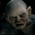
Even those crappy, low-effort tombs looked great with the extra-dark lighting… The difference in the tiles! It’s crazy how bad this is… Even worse than David Drowie (Minthara in her David Bowie incarnation).
All I wanted was some eye-candy to go with the geekery of the DnD stuff. Basically just some attractive escapism. If I want to strategise ‘for real’, I just go back to my 9-5.
Now all this game has is gameplay, and nah – I’ve better things to be doing with my life than playing through a 100 hours of looking at this washed-out goop.
I can’t stop lol’ing at the last pic. PS5-ish to cheap early PS3 in just one patch.
Yikes…
Anyway, it’s only a game. Sometimes they end up like the stuff we animals deposit in the various toilets of the world – you just have to flush and move on. Cya BG3 – was looking promising there for a while, but I guess y’all have a desperate deadline to meet…
|
|
|
|
|
|
veteran
|
|
OP
veteran
Joined: Jun 2022
|
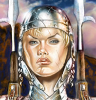
Have you used the same settings for that elf regarding skin tone or did the patch come with personal fake tan sprays? Yup, exactly the same appearance in both images as this is the default character that you get when you press "NEW GAME", so this is how she looks between Patch 7 and Patch 8. As for the hair, I personally think the new hair models are fantastic and and can't wait to see physics added back to them. Hair actually looks like hair now... if we ignore the eye stinging colors ^^
|
|
|
|
|
|
journeyman
|
|
journeyman
Joined: Jun 2022
|
Here are some more comparison images between the patches. Apart from the ugly bland and washed out colors, the contrast is entirely gone and everything seems to be tinted now. The area around the crashed Nautiloid is tinted in blue, but I was shocked to see the goblin camp go from the actual dark and gritty warcamp atmosphere to whatever that is. I see it now. I see the problem. They added that stupid blurry fog effect that every moder under the sun creates a mod to remove day 1, because it makes the game look like ass. Why haven't developers realized this yet? Stop using that!
Last edited by PixieStix2; 09/07/22 05:16 AM.
|
|
|
|
|
|
member
|
|
member
Joined: Feb 2021
|
Thanks for making me reconsider downloading and installing again.
|
|
|
|
|
|
veteran
|
|
veteran
Joined: Aug 2020
|
Wow, I'm genuinely shocked at how vehement the hate for this change is. I get not liking it, there's plenty not to like, but I never expected this to garner so much passion. Seeing genuine insults getting thrown out makes me want to knee-jerk point out that real life is plenty vibrant and bright too, but after taking a beat, I do get that it's about creating an atmosphere and impression. While I find using the term realistic in relation to this kind of thing tedious, I will agree that color and art direction are important for creating a sense of mood and style that puts the player in the write headspace, whether it's actually realistic or not. I also don't see all the problems people are pointing out in the screenshots, but I see some of them, and I can't say that the change is actually an improvement. Some things look the same to me, some things look worse, which adds up to a net loss.
|
|
|
|
|
|
old hand
|
|
old hand
Joined: Sep 2020
|
They added that stupid blurry fog effect that every moder under the sun creates a mod to remove day 1 Those screenshots definitely look blurry now and also like the brightness got turned up too high. I hope they revert this change. Also I want the darker hair colours back (especially a proper black.) What we have now seems to be either washed out medium and light shades and a Manic Panic showcase. They could easily add the old colours back in by replacing several of the similar and duplicated fake shades.
|
|
|
|
|
|
veteran
|
|
veteran
Joined: Oct 2020
|
I dunno ... I can certainly sense some "we decided to give the Box to Shadowheart, and that led us into permutation hell ... instead of recognize the bad design and change the whole approach" vibes once again ... Bare with me for a second ... And tell me how far i am in your opinion: 1) In last (or previous? not sure honestly) patch, they decided to turn eyes of characters with Darkvision into flashlights ... It sounds great on paper, it seems awesome in first atempts ... but slowly it starts to show issues ... and there is more and more of them the futher you go ... That is equivalent of "lets give the box to Shadowheart" ... 2) People were complaining that PoV Darkvision sucks, bcs while it makes perfect sense from roleplay perspective ... we as a player (and not as a character) need to see our whole surroundings, not just small area in direct front of our character ... some areas had even with this feature overall visibility of tar pit ... especialy in the underdark ... especialy frustrating for characters with Supperior Darkvision, where your Drow should have ben able to see there (at least a bit) while he cant see his own nose. That sounds like equivalent of "we are aware it cause problems, but we want to keep it anyway, bcs we thought the basic idea is awesome" 3) Larian started to "fix" the overall darkness of whole world, by incerasing amount of light in the places ... Wich start causing yet another bunch of problems ... colors seems unnatural, places that should be dark and spooky are neither, darkvision is kinda loosing its purpose, since you can clearly see anywhere ... and areas starts to look really odd: - Owlbear is in the "cave" that have hole in its roof that could fit all 3 Ogres in it twice what kind of "cave" is that? - Nobody is able to find "perfectly hidden cellar of Neckromancer" but when you reach there, you can see on the floor that roof once again have holes in it where that Ogre could fall through once again! - The "dank crypt" ... why bother, its just the same over and over, holes everywhere, its miracle this place still hold together. -_- INSTEAD of simply accept that this idea, even tho it sounded cool, was bad one ... and rewind back to patch 1 Darkvision, where our Darkvisioning characters were simply source of their own "cold light" and whole space around them litteraly looked differently.  That is equivalent of "we will rather try hard to create bzillions of permutation for meeting with Shadowheart, than give that stupid box to player right after he leaves first room." What do you think? Am i on right track, or completely off?
Last edited by RagnarokCzD; 09/07/22 10:42 AM.
I still dont understand why cant we change Race for our hirelings. Lets us play Githyanki as racist as they trully are!
|
|
|
|
|
|
veteran
|
|
veteran
Joined: Aug 2020
|
I mean, I haven't seen how darkvision looks now, but it does atleast feel like it could be true. It feels like that sort of overcommitment could be at play, certainly.
|
|
|
|
|
|
addict
|
|
addict
Joined: Oct 2020
|
They had to downgrade it for console and Stadia gamers lol.
|
|
|
|
|
|
stranger
|
|
stranger
Joined: Jul 2022
|
I'm certainly missing the darker colours. Everything is too bright now
|
|
|
|
|
|
old hand
|
|
old hand
Joined: Oct 2021
|
INSTEAD of simply accept that this idea, even tho it sounded cool, was bad one ... and rewind back to patch 1 Darkvision, where our Darkvisioning characters were simply source of their own "cold light" and whole space around them litteraly looked differently. That is equivalent of "we will rather try hard to create bzillions of permutation for meeting with Shadowheart, than give that stupid box to player right after he leaves first room." What do you think? Am i on right track, or completely off? You are I believe exactly on track. I've never watched a PFH before but to hear Sven constantly asking about throwing the gnome was as revealing as it was annoying.
|
|
|
|
|
|
veteran
|
|
veteran
Joined: Oct 2021
|
Yeah, I preferred the old version of darkvision, where everything changed with the character selected. The flashlight eyes didn't provide enough illumination for the player.
I think one of the reasons for the environmental lighting change is because things were difficult to see in the last patch. As a player, I needed the light spell or torches, even on characters with darkvision.
Now I don't need the light spell, and my eyes haven't gotten any better.
*
In general, I want it to look dark for characters without darkvision. I want to need a light source, not just for combat, but also for navigating. However, I want characters with darkvision to be able to see without torches, again, not just for combat, but also for purposes of navigating.
I'm pretty sure that's what most players want.
|
|
|
|
|
|
veteran
|
|
veteran
Joined: Oct 2020
|
I'm pretty sure that's what most players want. Agreed ... Funny enough that is also what players had ... with that older system. :-/ Too bad Larian decided to "improove" it ... and when that didnt work they start to "improoving" rest of the world, so their bad "improvement" work, instead of rewerting it back and simply say "we tryed, we failed, we fixed ... and now can move on".
I still dont understand why cant we change Race for our hirelings. Lets us play Githyanki as racist as they trully are!
|
|
|
|
|
|
veteran
|
|
OP
veteran
Joined: Jun 2022
|
While I find using the term realistic in relation to this kind of thing tedious, I will agree that color and art direction are important for creating a sense of mood and style that puts the player in the write headspace, whether it's actually realistic or not. True, I suppose a better term would be "natural" then. The reason why I used the term realistic is because the game's atmosphere truly looked realistic, like something you could see in real life. Something that is relatable. Best examples are showcases #2 and #3. In showcase #2 you can see everything lit up beautifully and the shadows actually dark. There's actual contrast to the whole scenery and everything has its own color: - the tree bark is brown,
- the leaves are green,
- the Nautiloid is dark gray,
- the Nautiloid goo is dark purple
- the sand is actually golden
- the shadows are dark black
And then when you compare it to Patch 8, you can see everything got brightened up, washed out and tinted in blue. It became 50 shades of blue. Contrast is completely gone and so is individuality of colors. It went from looking beautifully natural to ugly. ![[Linked Image from i.imgur.com]](https://i.imgur.com/nG4lU91.jpg) In showcase #3 it is the same thing. The lighting in this scenery looked beautifully natural, everything had its own color and there was contrast. But now everything got brightened up, washed out and tinted in blue. ![[Linked Image from i.imgur.com]](https://i.imgur.com/LxIr3W3.jpg) A fair comparison would be like the artistic difference between Lord Of The Rings and The Hobbit trilogies. One was filmed in actual locations with real landscapes and very little CGI, while the other was mostly filmed in a studio behind a green screen. There's a reason why LOTR won so many Oscars and why it's regarded as one of the best movies of all time. Apart from the story and actors and music, it won for best cinematography and best visuals as one of many awards. Because it beautifully blended all of the different natural and unnatural elements together, which made the movie look so believable, because those unnatural elements looked real. Compare that then to the Hobbit, where you can clearly tell what is CGI and what is not.
|
|
|
|
|
|
Banned
|
|
Banned
Joined: Jul 2022
|
Wow, I'm genuinely shocked at how vehement the hate for this change is. I get not liking it, there's plenty not to like, but I never expected this to garner so much passion. I work as a dev – but even if you didn’t, common sense will tell you that if they already created the config for a darker, more atmospheric lighting system, then making it an optional setting in the ‘graphics’ tab is trivial. The case would be closed right there: it would appease both sides, with minimal to no effort. Instead, they make this reworked gaudy lighting system the ‘new norm’ and we’re all supposed to just accept that. As for your apparent bafflement re: the ‘impassioned’ loathing of the thing – well, that’s simply down to tastes. Which are a thing. On a sensory level, our brains have vastly different, and unfathomably complicated, ways of processing what we see, hear, smell. I also paint/sketch as a hobby – in particular as a kid my sketches tended towards hyper-realism/photorealistic renderings of every little detail. I don’t think I’ve lost this kind of attention to detail, and genuinely disagree that anything in those photos looks remotely similar, as you appear to suggest: ‘Some things look the same to me’. We’ll have to just agree to disagree – but we’re only talking about a mechanical evaluation of differences there, of which there are many. It’s the dramatic stylistic change that’s the worst offender here. As I mentioned, if you throw ‘chiaroscuro’ into google images, you’ll see Larian – whether by fluke or otherwise – had achieved this remarkable style in the left screenshots (particularly pic 3, 4 and 10). It’s a very powerful style, accomplished with mere shadows: take out the shadows, and the images don’t have a fraction of the power. While that’s an opinion, and opinions are by no means fact, I feel the new washed out, brighter world is dull as dishwater. It’s boring to look at: what once sparked the imagination and ignited the senses is gone completely. You may not feel the same way, but like I mentioned we’re not all created equal in that respect. Just as it is with food – I’m certain there are some dishes you despise that your pals might adore. Of course we all have very strong, very different reactions to the same sensory stimuli. This is especially true on a visual level: how my brain reacts to a woman is very different to how it reacts to a man (neutral/indifference to potential vomit, depending on the male image in question). You’re correct in that the ‘real world’ is indeed ‘plenty vibrant and bright too’ – but so too so are many of the examples in the Patch 7 photos (pic 6 and 7 are in fact more vibrant than the washed out Patch 8 equivalents, ironically because of the heavier shadows providing sharper emphasis to the brighter colours). The main complaint is about the watering down of the shadow detail, to the point it might as well not exist – which is not true to reality (not that it would have to be, since we’re talking an art style here). The brightest sunshine casts the darkest shadows, but even in the grim overcast light of today, there is shadow/light drama aplenty that’s more than enough to inspire a painting or a sketch. The only convincing argument I’ve read here in favour of the new lighting system is that ‘too dark’ is an accessibility issue. That’s fine: make it an option in the graphical settings then. Win-win, end of the problem.
Last edited by konmehn; 09/07/22 03:07 PM.
|
|
|
|
|
|
veteran
|
|
veteran
Joined: Aug 2020
|
I appreciate the in-depth responses I've gotten, it's done a great deal to help me contextualize people's perspectives. I think I was shocked by the intensity of some of the posts because it's an intensity that I don't feel like I see on the forums elsewhere, even on topics people are clearly invested in. I suspect that might be because this is something big and new. By this point, a lot of people have been ground down in their back and forth, so there's just not as much passion for them to muster, but this is getting the benefit of fresh emotion.
I'm not an artist, and have never been much of an art appreciator, not in depth anyway, so I doubt I'll ever see things in the same detail and depth that you do. That having been said, none of the example shots I've seen show the new version of the lighting looking better in my untutored opinion. Which tells me that the change is a net negative, just one that I'd be able to live with. But even then, I'm gonna support anyone saying things should go back to the older, better version. If the change really is about accessibility, then I support the impulse but it can absolutley be just a setting thing.
|
|
|
|
|
|
veteran
|
|
veteran
Joined: Oct 2020
|
I work as a dev – but even if you didn’t, common sense will tell you that if they already created the config for a darker, more atmospheric lighting system, then making it an optional setting in the ‘graphics’ tab is trivial. The case would be closed right there: it would appease both sides, with minimal to no effort. I should save this quote for later uses ... :3
I still dont understand why cant we change Race for our hirelings. Lets us play Githyanki as racist as they trully are!
|
|
|
|
|
|
member
|
|
member
Joined: Nov 2020
|
I don't like new Alfira's colours.
She looks literally cartoony.
|
|
|
|
|
|
Banned
|
|
Banned
Joined: Jul 2022
|
I should save this quote for later uses ... :3 What are you suggesting here, exactly? There seems to be some implied snark. I build UIs for a living – and while I agree 'dev' is a largely broad term, and everyone’s a specialist of some form, we are talking about a UI-enhancement to the graphical settings that simply toggles a technically lowkey graphical detail: the hues of assets and the opacity of shadows. This doesn’t require an engine overhaul, nor does it involve any changes to, for example, something like ray-tracing. You can clearly see the same shadows are rendered in both left and right photos – the opacity has simply been muted out of existence. I.e. screenshot 3: note the armour shadows are identical in every respect. There’s literally no difference in the rendering of them – but the opacity has changed from what would seem a 0.9 (left) to something like a 0.3/4 (right). The same is true of the staff. Screenshot 5: this the most uncomplicated example – it’s clear as the beach’s daylight that there’s no difference in the shadow-rendering, except for the opacity. Screenshot 6: same thing. Identical shadow rendering, right over to the tentacles and the shadows of the rocks, yet there’s a dramatic difference in the crispness of the images, with the right image looking like some phoney otherworld. Only in Screenshot 4 does there appear to be any hue manipulation – the softer pink of the sparking machine and the floor in the right pic versus the gnarly pink-grey in the left. But that’s merely a hue. I’m not a game dev, but feel free to ask me any question on the topics of Firebase, TypeScript, React/Angular, React Native etc – I’ve 11 years in the industry and am a lead in my job. Definitely have nothing to hide. So in effect what is being asked for is a simple new UI slider that alters the hues of the assets from campy-bright to gritty-grim, and then the opacity of the shadows. That’s it. Unless you’re telling me that in game dev such UIs and value changes don’t work in a similar fashion as it would translate to technical effort – in which case, I’d love to hear your ‘expertise’ on the subject, as it doesn’t add up to me.
|
|
|
|
|


![[Linked Image from i.imgur.com]](https://i.imgur.com/97kmREb.jpg)
![[Linked Image from i.imgur.com]](https://i.imgur.com/ZGgJrOg.jpg)
![[Linked Image from i.imgur.com]](https://i.imgur.com/512VaJl.jpg)
![[Linked Image from i.imgur.com]](https://i.imgur.com/qFaU1eq.jpg)
![[Linked Image from i.imgur.com]](https://i.imgur.com/iQRVPdW.jpg)
![[Linked Image from i.imgur.com]](https://i.imgur.com/kouOlBC.jpg)