|
|
|
veteran
|
OP

veteran
Joined: Jun 2022
|
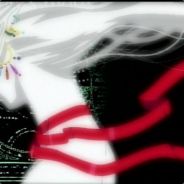
Please make the colors look natural and lighting immersive again as unfortunately the characters look too vibrant and environments too washed out, brightened and tinted after Patch 8, due to lighting changes. BG3 looked impressively dark, gritty, realistic, natural and incredibly immersive in terms of its setting and lighting prior to the patch, where every scenery was worth a thousand words as it perfectly blended different shades of colors and shadows in order to create such beautifully unique atmosphere in every area of the game... but now it looks the complete opposite. The characters seem to be the worst with these lighting changes, especially with hair, make-up and outfits, because previously every color was subtle and had different shades of light and dark to choose from, but now it's just really sharp colors going from vibrant to very vibrant, so it ends up looking really fake and out of place when it should be looking natural. Outfits went from looking really realistic and rugged to fake looking. As for the rest of the game, specifically environments, everything now looks awfully bright, washed out without a contrast and tinted. Even the dark places such as crypts or the Underdark are no longer dark and lost their creepy dungeon atmosphere. The impressive scenery that was previously worth admiring is now non-existent unfortunately, as it no longer oozes that captivating atmosphere that made the game so attractive to the eyes. Here are comparison shots between Patch 7 and Patch 8.
The Underdark comparison shots are located on the 3rd page.CHARACTERSThis is my character using exactly the same colors in both updates. Darkest purple color got turned into vibrant purple, same with darker versions of other colors. And you can observe how terrible the leather shoulderpad looks now, doesn't look like rugged leather at all.![[Linked Image from i.imgur.com]](https://i.imgur.com/97kmREb.jpg) Outfits went from looking beautifully realistic and worn-out rugged adventurer's clothes to over-saturated downgrades that look more like cosplay outfits. ![[Linked Image from i.imgur.com]](https://i.imgur.com/xlgAAqN.jpg) Lae'zel went from a dark brown hair color to light brown, so did her armor. Doesn't nearly look as good. ![[Linked Image from i.imgur.com]](https://i.imgur.com/HULg5D6.jpg) ENVIRONMENT ENVIRONMENTEnvironments went from sceneries worth admiring due to their artistically beautiful and immersive tones that create a unique sense of dread, mystery and exploration, to washed out color tinted areas that no longer have any contrast nor unique atmosphere worth admiring because all of the details are drowning underneath the mess. ![[Linked Image from i.imgur.com]](https://i.imgur.com/ZGgJrOg.jpg) ![[Linked Image from i.imgur.com]](https://i.imgur.com/nG4lU91.jpg) ![[Linked Image from i.imgur.com]](https://i.imgur.com/LxIr3W3.jpg) ![[Linked Image from i.imgur.com]](https://i.imgur.com/512VaJl.jpg) ![[Linked Image from i.imgur.com]](https://i.imgur.com/qFaU1eq.jpg) ![[Linked Image from i.imgur.com]](https://i.imgur.com/iQRVPdW.jpg) ![[Linked Image from i.imgur.com]](https://i.imgur.com/kouOlBC.jpg)
|
|
|
|
|
|
addict
|
|
addict
Joined: Oct 2020
|
But you have to appreciate their work with the lighting! They spent 6 months working on that!
/Sarcasm off
Yeah, I agree with you.
|
|
|
|
|
|
enthusiast
|
|
enthusiast
Joined: Aug 2019
|
I fear I must agree with you as well. I guess we can only be thankful that it's not as sickeningly vibrant as DOS 1 was.
|
|
|
|
|
|
Jhe'stil Kith'rak
|
|
Jhe'stil Kith'rak
Joined: Oct 2021
|
Remember the human (This is a forum for a video game):
|
|
|
|
|
|
old hand
|
|
old hand
Joined: Apr 2022
|
Honestly it looked better before the patch. Everything blended nicely, looked gritty and fit the setting. Classic case of worsening improvement. These vibrant colors even give new meaning to Caerlar Argent's title, The Shining Lady.  Wildheart Barbarian piercings for all characters would have been a better implementation...
Last edited by Lotus Noctus; 08/07/22 03:55 AM.
|
|
|
|
|
|
addict
|
|
addict
Joined: Oct 2020
|
wow that Patch 8 light brown leather armor looks like shit.
We are back to happy colors boys and girls!
|
|
|
|
|
|
Van'tal
Unregistered
|
|
Van'tal
Unregistered
|
wow that Patch 8 light brown leather armor looks like shit.
We are back to happy colors boys and girls! If it aint broke...
|
|
|
|
|
|
veteran
|
|
veteran
Joined: Aug 2014
|
It really did look better before.
Someone decided they now want to do a bright vibrant happy game instead of a more realistic gritty game where mind flayers, dark cultists and vampires murder people? Ironically, the lighthearted Bard would also stand out much more in the latter. Playing happy music (with realistic dyed hair) in a gritty setting would be much more powerful than playing the same music in bright pink hair in a bright vibrant setting.
|
|
|
|
|
|
Van'tal
Unregistered
|
|
Van'tal
Unregistered
|
Perhaps they were looking to make festive outfits for the Bards.
Maybe Undo the change and add some colors to the pallet.
|
|
|
|
|
|
old hand
|
|
old hand
Joined: Oct 2020
|
People complained earlier about it beeing to dark. Now its to bright? They really cant win, can they 
|
|
|
|
|
|
old hand
|
|
old hand
Joined: Oct 2020
|
|
|
|
|
|
|
veteran
|
|
OP
veteran
Joined: Jun 2022
|
So after playing for a few hours and checking out a few places, the game really took a nosedive in graphical quality with the new lighting changes... from over-saturated vibrant colors on characters to washed out bland colors throughout the environment. The lighting does look great in certain cinematic scenarios, but the rest of the game looks disappointing to look at. Mostly because I used to admire a lot of the scenery in the game and it looked great. Here is an example of Overgrown Ruins and how terrible it looks now. It's no longer dark nor spooky nor does it feel like a cold empty tomb. And even with all light sources turned off, it's so bright that you don't need a torch nor Dark Vision to go through it. The colors of the environment look washed out as if brightness was turned up, while the colors on the characters are so distracting due to their saturation and thus stick out like a sore thumb. ![[Linked Image from i.imgur.com]](https://i.imgur.com/71NHDCT.jpg) Really hope this gets tweaked and improved so the game looks realistically dark and gritty and immersive with proper colors again, because this is disappointing. Brought back memories of what happened to Diablo 3 between alpha and launch, when it went from a serious and gritty diabolical atmosphere to a colorful fantasy land which didn't match the setting whatsoever.
|
|
|
|
|
|
addict
|
|
addict
Joined: Oct 2020
|
So after playing for a few hours and checking out a few places, the game really took a nosedive in graphical quality with the new lighting changes... from over-saturated vibrant colors on characters to washed out bland colors throughout the environment. The lighting does look great in certain cinematic scenarios, but the rest of the game looks disappointing to look at. Mostly because I used to admire a lot of the scenery in the game and it looked great. Here is an example of Overgrown Ruins and how terrible it looks now. It's no longer dark nor spooky nor does it feel like a cold empty tomb. And even with all light sources turned off, it's so bright that you don't need a torch nor Dark Vision to go through it. The colors of the environment look washed out as if brightness was turned up, while the colors on the characters are so distracting due to their saturation and thus stick out like a sore thumb. Really hope this gets tweaked and improved so the game looks realistically dark and gritty and immersive with proper colors again, because this is disappointing. Brought back memories of what happened to Diablo 3 between alpha and launch, when it went from a serious and gritty diabolical atmosphere to a colorful fantasy land which didn't match the setting whatsoever. I'm glad that you point out those cinematics since that felt like it was highlighted in the panel but they never really talked about how the rest of the game would be affected.
|
|
|
|
|
|
addict
|
|
addict
Joined: Oct 2021
|
+1
There also seems to be a noticeable difference between facial hair and (head?) hair, almost as if the facial didn't get the shiny gloss of "Patch 8 Herbal Essence."
Last edited by Ranxerox; 08/07/22 10:02 PM.
|
|
|
|
|
|
addict
|
|
addict
Joined: Oct 2020
|
+1
There also seems to be a noticeable difference between facial hair and (head?) hair, almost as if the facial didn't get the shiny gloss of "Patch 8 Herbal Essence." That's because they apparently aren't "worth it" :P
|
|
|
|
|
|
addict
|
|
addict
Joined: Oct 2020
|
It definitely looks too bright and vibrant now, I much prefer the old look for sure.
|
|
|
|
|
|
Banned
|
|
Banned
Joined: Jul 2022
|
This topic is so perfectly on-point, I was compelled to make an a/c here to C&P what I’ve posted elsewhere (warning: it’s a rant). Apparently ‘they’ only look at Larian forums, so hopefully ‘they’ will look at this thread. I’ve edited some parts, as I made explicit reference to this thread from elsewhere. I’m stunned, to be honest, by what has happened with the art direction re: lighting. So here’s my endorsement of the OP's very valid remarks:
***
Some people clearly like their lighting to be neon-emblazoned camp, while others, like myself, prefer an earthier grit, something akin to a painting from the old masters – who clearly had more brains in the art department than Larian’s inept artistic leadership.
I haven’t played the game in months, so at first I thought I was mistaken for thinking the lighting had turned into this monotone candy-sludge. But the more I pressed on through the illithid ship, the more wretched the graphics became, until I emerged into the rancid sunlight of the beach and its surrounding visual puke.
The above Patch7/Patch 8 comparison photos deftly highlight the godawful U-turn they took with the lighting. There’s even loss of detail in the armour, as the OP notes. But look at that lurid rainbow-emblazed hair. Good Christ, my eyes…
Now check out how brilliantly the light alone transforms the illithid ship in Patch 7 to a sinister, foreboding and atmospheric lair of mystery and malignance. And look how such a simple change to ‘mere light’ in the Patch 8 screenshot can immediately devastate all the hard work the art team put into the assets.
I mean, this is what the art directors were doing for the last 6 months? In other words, they were actually undoing the progress made in the visuals.
It almost smacks of sabotage, it’s that obnoxious. As thoug¬h some conniving creative cutthroat decided the art asset team were getting too much kudos from the community – so it was time to bring them down a notch, by dousing all their great work in a florid sea of camp.
Now the visuals have been brought down to the stomach-churning mediocrity and ‘safeness’ of the tepid narrative. So there’s only the gameplay left – and could I endure a 100 hours of aesthetic vomit even if the gameplay was A1? No. I need at least some artistic chutzpah to enjoy these things – I don’t just play the games for the mechanics.
Now even – yes! – Blizzard have surpassed Larian in the visual department, with their superlative effort in the recent D4 updates: getting better and better. This is it now, people: the notorious Blizzard, once the grand-high lord of mainstream sell-out-ism, shows more creative daring, more maturity, more intelligence, more balls and more talent.
This lighting change is absolutely execrable stuff from people who don’t even work for a living – who get paid to have ‘fun’. I’m talking about the art directors, not the poor schmucks who have to listen to these talentless hacks.
On a positive note, it is technically ‘just’ lighting (in other words, doesn’t involve an entire graphics engine overhaul to change) – and surely they still have the far, far better previous lighting presets available. Just expose it as an option! Lighting has an unprecedented effect on atmosphere. One wrong turn can turn a great work of art into a monstrosity.
Just google ‘chiaroscuro’ and feast your eyes on the unparalleled evocativeness of extreme light against extreme dark. Now these are visuals with personality, balls, depth, intrigue and power. They’ve almost completely eradicated the colour black from their lighting.
What is wrong with these people who insist on such lurid, rainbow, glow-stick pustule-picture? It’s like the Dragon Age Dreadwolf logo reveal. Months before, I wrote – on other forums – that the initial reveal art for DAD was head-spinning-ly, out-of-control camp, with gratuitous glowing neon effects sparking out from every character and city. I was told by one guy that it was early days and no way were these an indication of what was to come.
It’s as if they read my remark and, as though to ‘stick it’ to me, made their official logo look like some thrashy Saints Row knock-off, all gaudy purples and fluorescent, sparkling visual diarrhoea.
Once again, I implore you to google chiaroscuro and see what could be – what was, in fact – and lament. Now please forgive me while I step away: my eyes have started to bleed again.
|
|
|
|
|
|
Van'tal
Unregistered
|
|
Van'tal
Unregistered
|
The absolutely highest praise that BG3 has gotten is in the graphics department...like unanimously.
Now the complaints start...they should roll back the changes.
I don't like what I am seeing overall with the color scheme, it looks crap now.
I haven't made up my mind on the individual tweaks to certain characters.
The leather in particular looked stunning before the changes.
This one of those times when negative feedback is not malicious..."You have a boog hangin'".
Absolute Crap!
Last edited by Van'tal; 09/07/22 01:04 AM.
|
|
|
|
|
|
journeyman
|
|
journeyman
Joined: Jun 2022
|
Thanks for the side by side. I thought something felt off, but couldn't put my finger on it. I thought it was because the darks weren't dark enough and this pretty much proves it. It also shows that the textures got blurred out too. Which is odd because many other things like skin textures look sharper and so do rocks and other random elements. Then I run into situations where some areas are too dark and others are way to bright.
Oh and one other thing I noticed. I know they tried doing something with the sound to help things sound better and many things do, but many other things don't. Like for example before the Barbarian cry was loud and intimidating. It was just great and now its muted. You barely hear it over the battle.
Last edited by PixieStix2; 09/07/22 12:00 AM.
|
|
|
|
|
|
veteran
|
|
OP
veteran
Joined: Jun 2022
|
Here are some more comparison images between the patches. Apart from the ugly bland and washed out colors, the contrast is entirely gone and everything seems to be tinted now. The area around the crashed Nautiloid is tinted in blue, but I was shocked to see the goblin camp go from the actual dark and gritty warcamp atmosphere to whatever that is.
|
|
|
|
|


![[Linked Image from bg3.wiki]](https://bg3.wiki/w/images/thumb/d/d4/Minthara_Approval.png/26px-Minthara_Approval.png)